The square is the current darling of the design community, with Microsoft as its biggest supporter. But once you start to look for them, you realize many others are embracing the square too. It's not too hard to figure out, you see them everyday.

If you’ve bought a computer lately, browsed the Web, or downloaded an app, you may have noticed a hot new trend sweeping the world of design. Everything from Pinterest to Windows 8 has it. The grid is in, baby. You can’t play fair unless you’re made of squares. Now, you may think we’re crazy (but we don’t even care), but we know exactly what’s going on. You don’t have to be a Huey Lewis & The News fan to realize, everyone thinks it’s hip to be square.
Yes, the square is the current darling of the design world and the grid is its home. It’s already becoming almost cliche to incorporate them in a redesign or new product. Once you start to look for it, the square is taking over. They. Are. Everywhere. Five years from now, we’re going to hate them.
It hasn’t always been hip
If we look back at web design trends, boxes have, of course, always been around because they’re great for buttons. Except up until a few years ago, the majority of these boxes had rounded corners.
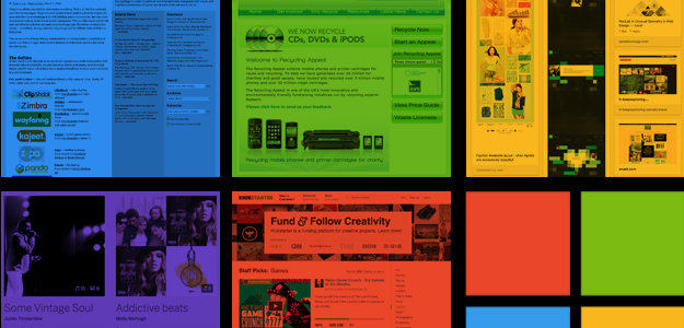
Using rounded corners and shiny gradients was one of the hallmarks of Web 2.0. This article by FontFeed in 2006 calls the use of rounded fonts “a clear trend.” It didn’t stop at text either, just take a look at this site, RecyclingAppeal, to see that not only does it have those other Web 2.0 basics – the centralized layout and large header – every button, tab and box has rounded corners.
While this style of Web 2.0 design hasn’t stood the test of time, other examples are far more resilient, the most perfect example of which being Apple’s iOS. Introduced in 2007, every button on the homescreen has a smoothed out corner – no sharp edges for Apple. This wasn’t any Web 2.0 nonsense either, as boxes with rounded corners had been part of Apple’s design language for years. The entire OS is full of textures and gradients as well.
The story goes that in early 1981, Mac developer extraordinaire Bill Atkinson was showing Steve Jobs the way QuickDraw rendered ovals and circles. Jobs wanted to know how good it was at drawing rectangles with rounded corners, which he said were everywhere around him, from the whiteboard to a no-parking sign. Atkinson wasn’t sure if he could do it, but tried anyway and the day after he showed Jobs the “RoundRects” he so desired.
 Microsoft the trendsetter?
In early 2010, Microsoft revealed Windows Phone 7, which used a new and, at the time, rather unusual ‘Metro’ interface, which used a grid of squares and rectangles for a homepage instead of traditional icon shortcuts. Microsoft has since fully embraced the square. In Windows 8, squares and rectangles are absolutely everywhere. The new Windows 8 logo is a collection of squares on a grid, sometimes shown with perspective, and its Modern UI interface (the new name for ‘Metro’) is mostly squares, which Microsoft likes to call Live Tiles.
Head over to Windows Phone 8 and it’s the same story: more squares. It’s safe to say Microsoft is a fan of shapes with equal length sides, and it’s not shy about using them.
Windows 8 is expected to influence Web design next year too, with several design sites listing tile-based interfaces and bold, bright colors as a potential trends for 2013. Another potential trend for the coming year is brand over design, where branding will influence the way corporate websites appear, and as more companies are choosing the square in their logos, so the more they’ll appear online and in advertising.
The Pinterest-ification of the Web
But is Microsoft the only one with a square fetish? Let’s ask another tech site. How about The Verge? It knows a thing or two about corners. The tech site shares Microsoft’s preference for four-sided polygons. It’s homepage design is reminiscent of Windows 8.
Then there’s Pinterest, which may be as influential as Windows 8 when it comes to Web design. Pinterest is loaded with squares, and after scrolling down half a page, the screen is filled with the things. There’s even – irony of ironies – a “squares on websites” Pinterest board dedicated to sharing images of websites filled with right angles. Pinterest’s design has spawned innumerable copy cats. Everyone wants a site full of uneven squares on a grid, and lots of pictures.
Justin Timberlake may have a thing for squares too, or if not, someone in the design team over at MySpace certainly does, as the site’s recently unveiled new look is again, all about squares and the cursed rectangle. MySpace desperately wants to be hip again. This new design is a path toward that redemption.
Finally, there’s the ultimate square worshiper of all: Square. A company that uses the square in its name and logo, and shapes its product like one.
Do squares slow our brains?
Despite their current proliferation, they may not be as effective as shapes with rounded corners. An article published at DesignModo quotes Professor Jurg Nanni, a Swiss mathematician, who says “A rectangle with sharp edges takes indeed a little bit more cognitive visible effort than for example an ellipse of the same size.” So, sharp edges slow down out brain function, while rounded shapes speed it up.
A writer at WebDesignDepot agrees, saying circles are especially helpful in mobile Web design, as users want faster, easy-on-the-eye navigation systems, and we’re more inclined to tap rounded buttons because of their similarity to the tips of our fingers.
Our design fetish with squares may be hiding a darker side, and with that in mind, it seems fitting that since we started off the article butchering Huey Lewis and the News’ famous lyrics, we should close by doing the same with Patrick Bateman’s thoughts on the band.
The square, then, is becoming the building block of modern design, symbolizing the pleasures of conformity and showing how companies recognize the importance of trends. The square has ended up representing a personal statement about the company itself, though of what I’m not quite sure.
Source : digitaltrends[dot]com


Post a Comment