Google Maps iOS vs. Apple Maps: An In-depth comparison

Google Maps is finally back and available for download on iOS. Since the switch to iOS 6, Apple's first-party created Maps app has been the default for navigation on Apple's mobile devices. With Google Maps now available again, will it be able to reclaim its throne?

Back in June of 2012, Apple made the announcement that it would no longer use Google’s services as its default Maps application starting with the release of iOS 6. Opting to end its partnership with the Google, the company behind the mobile operating system that has been cutting into its market share, Apple decided to go it alone and make its own Maps. When iOS 6 launched, we discovered maybe Tim Cook and the creators at Apple might not be great cartographers. With little alternative option, especially with no Google-powered app available, iOS device owners were lost - literally.

December 13 brought the return of Google Maps to iOS. An app that has been built from the ground up, redesigned for the iOS user in mind. It seems promising. Everyone wants Google Maps to be successful, but Google-made apps for iOS have disappointed before. Even Google can be guilty of rushing a final product or skimping on details, promising to fix them later, just to hit the market at an opportune time. With holiday travel sure to be on peoples’ minds over the coming weeks, how could Google possibly resist a release right now? If it works like it should, it will be the red nose of Rudolph guiding Santa’s sleigh. If it falls short, Apple and Google will be responsible for a lot of displaced families, ruined holiday parties, and unexpected snowbank collisions. 

The only way to see just how well Google Maps fairs in comparison to Apple’s own Maps app is to take a look at the tale of the tape, so we put them in the ring to duke it out on a variety of important categories. Check out our comparison, and make sure to take both options on a test drive of your own.

User interface

Usability is everything. If worse came to worse while searching for a location, you could pull into a local gas station or diner and ask for directions or pull out a paper map to act as a guide. It’s jus that none of that feels as cool as a well-timed swipe on your touch screen. This is especially true for Google Maps, where swipes dictate the majority of your actions. These gestures are simple and smoother than Apple’s offering. It’s also significantly quicker. With the new interface on Google Maps, you can tap on a location and then swipe up on the lower-third bar to see more details.

It’s clear that Google put a very intentional emphasis on quickness into Google Maps. In comparison to Apple’s Maps app, you can accomplish tasks like getting directions or finding details about a location in about half as many taps. By keeping menus accessible with a swipe motion and simplifying on-screen items to only what you need, Google keeps a very clean look that still allows users to navigate and complete actions easier than Apple. Both apps use vectors as opposed to tiles so both are notably quick when browsing the maps. Apple seems to go a little faster, but Google just has so much information and still moves at an impressive pace.

Apple does have the benefit from being the default mapping tool built into Apple’s iOS operating system so when it comes to overall integration, Apple has an advantage. If you’re a Siri search user, you might end up sticking with Apple simply for that feature. If total immersion into Apple is less important to you than the rest of the UI, though, Google has an edge.

Winner: Google Maps

Viewing modes

Most of your map viewing will probably be done on the standard map view. It’s the easiest to process and it simplifies things so you can focus on pertinent information like not missing the street you need to turn on. In this mode, Apple’s design looks a little better. It’s sharper and draws a better contrast between different areas, with parks in a vibrant green textured color or airports in purple. Google Maps has a fairly flat, bland tone to all of the colors. That said, when you’re looking at an area where streets run together or there are extra paths and byways, you’re more likely to see it on Google Maps than Apple. Looking at a street-dense city like New York, you’ll notice considerably more detail in the grid on Google, even if it doesn’t look as nice.

Both apps offer a traffic layover option that will display backups and traffic density in certain areas so you can avoid major traffic jams and find alternate routes. This is another area where Google just has more information, providing a more detailed map with traffic updates in areas that Apple misses. Neither have moved this feature out of major metropolitan areas, but Google has a clear advantage in cities that have the feature available.

Apple’s Satellite and Flyover view appeared like it would be a major selling point to the app when it was introduced. It’s definitely cool as a way to find some landmarks worth noting and to take a look at the graphically recreated layout of an area. It’s still limited to pretty populated areas at this point, so if you’re visiting your family in Middle of Nowhere, Kansas, you’re probably not going to see the local truck stop getting a 3D modeled makeover. Compare that to the unmatchable Street View, which has managed to pick up nooks and crannies of cities and towns across the U.S. and other countries around the world, and it’s really no contest. When you can see panoramic photos of a place, including the previously mentioned truck stop, there’s no real need for a 3D re-imagining. Street View remains Google’s ultimate trump card.

Winner: Google Maps

Search

Navigation apps exist to help us find stuff, which is really a process that starts at the search. Using the search bar on Google Maps for the first time will provide you with one of those moments where you didn’t realize what you were missing until it was right in front of you.

In comparison to some of the other mapping apps that we’ve looked at in the past, Apple Maps didn’t do too bad. It found pretty much everything we threw at it and its search results were adequate. Compared with Google Maps, though, Apple is left in the dust. Google does have the distinct advantage of being a search engine first, so one would expect its results to be better. Searching for the same destinations on both apps, Google usually displayed the expected destination as the top result – often before we even finished typing. Apple landed most of them in the top four or five results, but rarely did it make a correct guess until typing was completed.

Once you finished your search by selecting the result you wanted, Google marked the specific location and shows the area around it. Apple does the same, but it also keeps pins from the search on the map as well, presumably in case you accidentally selected the wrong result. It really clutters the screen more than anything and, while this is totally personifying an application, it doesn’t really show much confidence in the search results. Bonus point to Google because you can link your Google account and access your search history, so if you were searching for a bar to go to after work on your work computer (because who uses it for actual work?), Google will remember that and pull up the bar’s name when you begin typing it. It’s one of the perks of being an actual search engine and then expanding.

Winner: Google Maps

Navigation and directions

Both Google and Apple offer multiple ways to receive your directions as you travel. You can get the straight list with every step laid out to completion right away or you can take the step-by-step, voice guided option. Regardless of your choice for direction delivery, you’ll notice some fairly stark differences.

Apple clearly takes an advantage in looks, with a nice thematic street sign kind of feel for displaying turns and route information. The problem with it is it gets cluttered at times and can become difficult to read. Google has a very minimalistic approach, opting to have the default view zoomed in a bit more than apple and keeping the necessary information available without obscuring the map. If you want to see what your next steps will be and check your trip progress with a swipe on Google, a feature that isn’t available in Apple’s Maps.

There’s the little issue of accuracy that Apple Maps seems to have, and we’re sure that there may be little problems like this that pop up with Google as well. The difference seems to be that Google has a real inclination to make sure it is getting everything right. If there’s an issue that you notice, simply shake your device and you’ll have the ability to provide feedback. Google Maps even takes a screenshot of where you are to send along to the developers so they can get the problem fixed. Apple has a feedback option as well, but it doesn’t appear that it has been in any hurry to make corrections. Maybe with some real competition out now, it will have a bit more urgency.

Winner: Google Maps

Public Transit

This one feels a little unfair, but it’s a major part of transportation and we’d be remise to just exclude it completely. One of the biggest sore spots for Apple Maps users is the exclusion of real public transit options. When you attempt to map out your path using bus lines or subways and the like in Apple Maps, it will simply bring up a selection of other apps that can do this for you. Apple immediately punts away the option to other choices. Funny enough, if you have Google Maps installed, Apple will suggest you plug in your public transit requests over there.

We’re with Apple on this one. Google Maps has public transit options down pretty well. An impressively detailed listing of bus routes, tram and train navigation, and other options that includes details like fees for each option makes Google the clear choice, even if it would be by default anyway. Google goes so far as to even suggest walking or taking nearby public transportation options rather than drive when you’re heading to a close destination. 

Winner: Google Maps

Destination information

It’s great to have an app that will lead you to a restaurant of your choice, but it won’t really matter how right the directions were if the place is closed when you get there or it turns out the place kind of sucks. These issues can be remedied with accurate information about a given location, and both Apple and Google do a pretty good job of this.

Apple draws its information from Yelp, laying out reviews and basic information as provided from that service. It also has some images that rotate atop the menu, giving you a slight glimpse into the location. For whatever reason, this doesn’t always translate to the icons on the actual map when it comes to marking open businesses and providing accurate addresses. You’ll probably find yourself Googling the actual address and plugging that in rather than let Apple guide you to where it thinks a location is.

Instead of that, you could just use Google Maps. Google has even the smallest and most local destinations represented with accurate information, thanks in part to the Google+ Local integration. User submitted reviews and photos are displayed, as are business-provided hours of operation and contact information. There’s just more information than Apple can match, including a direct link to menus when available. Yelp is nice, but it’s not quite as comprehensive as Google’s local take integrated with information from Zagat. 

Winner: Google Maps

Conclusion

Obviously just counting up the wins by category, Google Maps is the clear victor. There is a very real difference in using these apps. You don’t just notice it in the directions or the fact that Google won’t try to make you drive through a lake, but even the user interface on Google’s offering is better. Google is a company that is built off information, so it’s really no surprise that nearly every area that revolves around data and detail is dominated by Google in this showdown. It has comprehensive information about businesses and destinations, a more fully developed grid of streets and pathways, better directions, functioning public transit maps, and more traffic data. If the conclusion isn’t clear to you, go download Google Maps. Even if you’ve been getting around just fine with Apple, and it’s definitely doable, Google Maps will be a wake up call to how good a navigation app can be – and even Google admits it’s not as complete as it wants it to be.

You can download Google Maps for iPhone for free from the iTunes App Store. Be sure to read our full hands on with Google Maps for a detailed look at it on its own. 


Source : digitaltrends[dot]com

Apple reintroduces app gifting to iOS, includes new ‘delivery date’ option

When iOS 6 launched in September, the ability to gift apps from Apple's mobile devices disappeared. Well, it's back – and now you can choose the exact date of delivery.

Those keen to gift apps from their iOS devices this holiday season will be pleased to know Apple has recently restored the ability to do just that. When iOS 6 was rolled out in September, the feature mysteriously disappeared, though it was still possible to do on a computer via the iTunes store.

9to5Mac spotted the reintroduction of the ‘gift’ feature, noting a neat little addition – the ability to specify the precise date, up to 90 days ahead, when the app should be delivered to the recipient. 

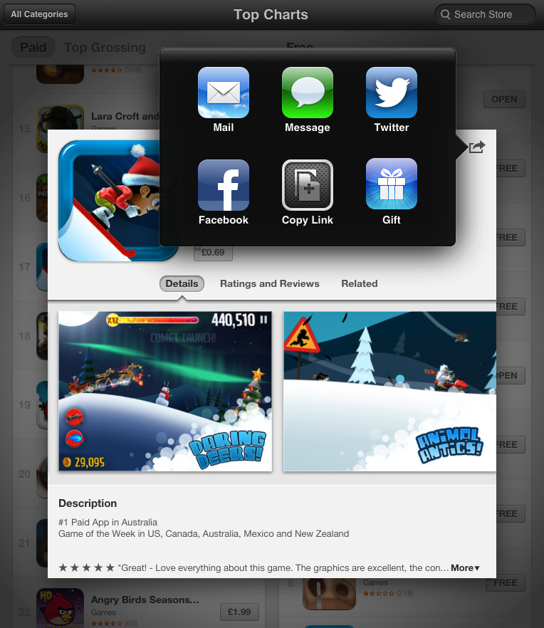
You can gift an app by tapping the action sheet button at the top right of your device’s screen. Next, simply tap the Gift button, fill out the recipient’s details, add a message, choose a date if you like, and you’re all set. If you’re feeling generous and would like to send a single app to a bunch of friends or members of your family in one go, you can also do that – simply enter each email address in the appropriate box (separated with a comma).

Anyone still using iOS 5 or lower can continue to gift apps in the usual way, by scrolling down the app’s details page and tapping the Gift this app button.

The fact that Apple has managed to reintroduce the feature just in time for the holidays should help score the company, as well as app developers, a few more sales in the run up to Christmas.

[Top image: Elisekurenbina / Shutterstock]


Source : digitaltrends[dot]com

Apple rolls out red carpet for top App Store apps and games of 2012

Apple rolls out red carpet for top App Store apps and games of 2012

Apple's App Store has come a long way

Apple revealed its lists of the top-selling apps and games of 2012 Thursday, dividing the installations into top free and paid iPhone and iPad apps.

On the iPhone side, Google's YouTube was the most popular free app of 2012.

Given YouTube's popularity, maybe Apple shouldn't have dropped it from iOS 6?

Instagram and Zynga's Draw Something came in second and third place in free iPhone apps, respectively, while Angry Birds Space, WhatsApp Messenger and Draw Something (the ad-free version) were the top three paid iPhone apps of the year.

Top iPad apps

Skype took top honors in the category of free iPad apps, with Imangi's Temple Run and the Facebook app earning second and third place.

On the paid iPad side of things, Rovio scored again, with Angry Birds Space HD taking the top spot.

Disney's Where's My Water? and Apple's own Pages app followed up as the second and third most popular paid iPad apps of the year.

That's not all, folks

In addition to revealing the most downloaded apps of the year, Apple revealed its selections for the best App Store apps and games of the year on iPhone and iPad.

Apple's iPhone app of the year was J.J. Abrams' Action Movie FX, which lets users add explosions and other "Hollywood FX" to videos.

Apple's favorite iPhone game was Rayman Jungle Run, a spin-off of Ubisoft's popular Rayman Origins.

The mystery game The Room was Apple's favorite 2012 iPad game, while creativity app Paper won for non-game iPad apps.

Clicking on the link below will take you directly to iTunes, where you can check out the rest of Apple's "best of" categories, including "Fun Runners," "Photo and Video Magic," "Casual Games" and more.

Though 2013 hasn't started yet, we have a feeling there's already a strong contender for next year's list.


Source : techradar[dot]com

More than half of U.S. shoppers would buy an iPhone 5, but most Americans own Android phones

iphone-4-vs-android

A survey from Piper Jaffray has indicated that the iPhone 5 will be most popular among smartphone shoppers. However, more Americans own Android handsets.

With the holidays just around the corner, shoppers are scrambling to snag smartphones, tablets and other gadgets that sit atop their loved ones’ wish lists. According to the analysts at Piper Jaffray, those in the market for a new handset are leaning toward the iPhone 5.

The investment banking firm reportedly surveyed more than 800 U.S. citizens, according to Apple Insider. The poll indicates that when it comes to the battle between Android and iOS, the numbers were nearly even pre-iPhone 5 launch. After Apple’s newest smartphone was unveiled in September, the numbers shifted a bit, with 54.9 percent voting that they would purchase an iPhone and 35.2 percent leaning toward Android. Piper Jaffray conducted a third poll this month, and the statistics have largely stayed the same, with 53.3 percent voting iOS and 35.3 percent voting Android.

“We believe this is a positive that demonstrates the majority of U.S. consumers want an iPhone 5 even following the launch craze, and despite the Maps issues that have been widely noted,” analyst Gene Munster said.

As for the remaining platforms, Windows Phone enthusiasm seemed to have declined since September, according to the survey. In September before the iPhone 5 was unveiled, 8.7 percent of those polled expressed interest in Microsoft’s mobile brand. That number fell to 5.2 percent in October during the second round of votes and increased slightly in December to 6.5 percent. Research in Motion’s Blackberry platform largely remained the same throughout the entire process, staying at 4.7 percent in September and October and moving to 4.9 percent in December.

While these numbers appear to sway in Apple’s favor, there is one crucial fact to keep in mind. These statistics are polls based on what American shoppers think they might purchase. They do not reflect the actual state of the mobile market. In fact, Android takes a pretty significant lead over Apple when you break down the current statistics. Gartner’s data from the third quarter of 2012 shows that Android accounts for a whopping 72.4 percent of the entire mobile market, while Apple only comprises 13.9 percent.

What’s curious is that so many potential American smartphone buyers have said they would purchase an iPhone 5 over an Android device. These survey numbers don’t seem to align with the reality of the smartphone market, but they’re still interesting to think about. 


Source : digitaltrends[dot]com

The Hobbit: An Unexpected Journey review: Return to Middle-earth (but choose your showing wisely)

Peter Jackson and company take us back to Middle Earth for the first of three installments based on The Hobbit. Just beware the frame rate.

The first thing to know about this film is that there are essentially two versions of The Hobbit: An Unexpected Journey floating around. They feature all the same content, but they are very different, and the level of love this film receives will be dominated by which version you see. Simply put: one is good, the other is not.

The difference comes in the way the film is shot. If you have been following this movie, then you’ve probably already heard the outcry that came following the debut of the footage at ComicCon. The film was shot at 48 frames per second, which is double the frame rate that films have been using for decades. According to Jackson, it brings a new level of clarity to the images. The fans watching loved the content of the footage, but seemed to universally deride the new fps.

Of course, this could be, and was mostly dismissed. The fans that go to ComicCon are hyper-aware of all the nuance and details, and they are also more critical for it. That criticism is generally justified, but the enflamed passions of hardcore fans can make a minor issue into a major one, and an annoyance can become a catastrophe. So while the frame rate was certainly cause for a concern, it didn’t necessarily mean it would be that big of a deal.

It is.

The 3D version of An Unexpected Journey uses this new frame rate, and the two visual effects combine for an experience that you will have to overcome rather than embrace. It’s not a good look in any way. The first issue is the intense clarity. It adds a strange look to everything, that actually makes everything seem a bit fake – even when the shot is of something very obviously real, like landscapes. Ironically it also makes the production and sets look cheap when they are both anything but. That is further exemplified by the unnatural speed at which the camera moves, which is beyond the possibility of actual movement. It zooms and pans too quickly, which gives a jarring and uneven visual presentation that is more akin to a bad edit in a TV movie than a multi-million dollar movie.

And then there is the speed of the action. The increased frame rate makes the action – even muted action like characters walking quickly – seem wrong. It’s almost as if the film moves 10-15 percent faster than it should. When the action shifts to an actual fight, characters move in a way that is off putting, because the action isn’t smooth or even. It just doesn’t make for easy viewing.

This visual style makes the entire film less than what it should be. It also cheapens the epic tone that the Lord of the Rings trilogy cultivated. You can make a valid argument that the films should be as different as the books were from one another, but that shift is easily accomplished tonally, and the visual change is for the worse, no matter what property it is used for.

Now, with that all being said, if you skip the 3D with its faster frame rate, then you are going to be treated to a much different experience.

Although The Hobbit is obviously connected to The Lord of the Rings on a very fundamental level, the two properties are also very different. When Tolkien wrote The Hobbit, he was coming from a very different place than when he wrote the follow-up trilogy. The book originally began as a series of anecdotes written for his son during World War I, and then brew into a children’s story that would be published in 1937. As such, despite the serious currents throughout, the tone was much lighter and meant for a younger audience. By the time he began work on The Lord of the Rings, Tolkien’s intended audience was completely different, and the content reflected that.

The Lord of the Rings trilogy was a complex myth for a modern age, complete with epic battles and mature themes. The films reflected that. By comparison, The Hobbit novel was a kids’ tale. That works in the greater context when you are reading the book and graduate from the simpler tale to the trilogy, but it presents a challenge for the film as a prequel.

It was a good initial decision from Jackson to take a step back when The Hobbit was first greenlit. The original idea was to have Guillermo del Toro take over the director duties, which would have naturally created a shift in tone. But then MGM collapsed and the film was left in limbo. Del Toro waited as long as he could, but he is simply too in demand to be permanently on hold for a project that he was not nearly as invested in as Jackson, so he moved on, leaving a gap – and a fear.

Del Toro seemed like a perfect pick with his background in sci-fi and fantasy, plus he was deeply involved in the pre-production, so replacing him would have meant trusting someone new with a beloved franchise that was already deep into production. Jackson was the only logical choice.

While the films are tied together as part of a set, tonally they need to feel very different, and so far they do. There is a greater sense of fun, more akin to the first half of Fellowship of the Ring before the weight of the quest began to show itself. The Hobbit is an adventure with plenty of dangers and a nearly impossible quest, but the individual characters aren’t as emotionally scarred by the outing. Despite the trials, they have fun. 

The scale is also a bit smaller, for the better. While the trilogy was meant to come across as an epic story that decided the fate of the entire world of Middle-earth, The Hobbit has a much more central focus, which lowers the stakes and allows the quest to succeed or fail without the same sense of consequence. 

Therefore the prequel trilogy won’t reach the same level of depth as the previous trilogy, and it won’t have the lasting cultural impact either. There is very little chance of surpassing the original, but they don’t need to in order to be successes. 

Those that aren’t familiar with the book but know the film trilogy may be surprised to see how effortlessly Martin Freeman (Hitchhikers Guide to the Galaxy, Sherlock) takes over the role of Bilbo. The older Bilbo (played by Ian Holmes) was the beneficiary of years of experience and trials that shaped his character, while Freeman’s Bilbo has the same core values, linking both actors’ portrayals, but his Bilbo has a youthful inexperience that is refreshing, welcome, and stands on its own among the other hobbits we’ve met.

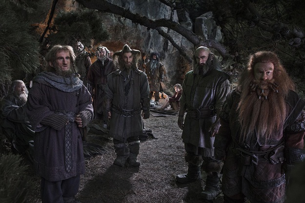
When a band of 12 dwarves unexpectedly drop by Bag End to answer the call of Thorin Oakenshield (played by Richard Armitage) and Gandalf (once again played by Ian McKellan), Bilbo is faced with a choice: to stay in the comfort of his home, or to risk the dangers and discomforts of the quest proposed. That quest will take him to The Lonely Mountain, once the home of the mightiest dwarf kingdom before the dragon Smaug came and forced out the dwarven inhabitants.

Thorin is the de facto replacement for the trilogy’s Aragorn, and is very much cut from the same cloth. The rightful heir to the lost kingdom, Thorin is the driving force of the story, while Gandalf is the brains and Bilbo is the heart. The other dwarves are flavor, and while some receive more attention than others, only a few are ever really considered important to the narrative. The film does a good job of trying to give each member at least one scene that makes each character memorable though, and it succeeds more often than not.

The party’s journey takes them through Middle-earth to several familiar haunts and locations, and their paths cross with many familiar faces – as well as a few new characters that are important to the future of the world Jackson has created.

There are several moments of action and wonder, but throughout it all, the somewhat melancholy nature of the trilogy, which gave it a haunting beauty at times, is deliberately gone. This film is meant to be far more fun than dramatic, and Jackson manages to create a unique tone that fits within the universe he created so masterfully. This new trilogy can’t compete with the previous one because of that, but it doesn’t need to in order to be enjoyable. 

The film moves along at a decent pace, and there is a traditional arc that ends with a resolution and a climactic final act despite the “to be continued” nature attached to any first film in a trilogy. Its ending raises questions though. The decision to make The Hobbit into two movies was understandable. The world is rich and intriguing, and original trilogy garnered so much good will that the more the better. The decision to stretch it to three films is tougher to justify.

The book is not that big or dense, and it lacks the deep mythology of the trilogy, which Tolkien worked to develop for nearly 20 years. The universe is so well detailed at this point that there is plenty of additional content that could be drawn upon, but the first film accounts for a major portion of the book and makes you wonder how the remainder will play out over two more films and at least four more hours (and probably closer to five). We’ll find out next year.

Conclusion

Peter Jackson knew exactly what he needed to do with The Hobbit: An Unexpected Journey. The film is a separate story that exists in the same universe as the Lord of the Rings trilogy, and while it feels at home in Middle-earth, the tone is far lighter throughout. As the name suggests, it is an adventure rather than a war, and the tone reflects that.

Freeman has the charisma and charm to make an excellent Bilbo, and Armitage’s Thorin is the traditional hero that a story like this needs. The others all serve their purpose too, but most are only slightly memorable. Over three movies though, this is certain to change.

The frame rate is a debacle, but it is one that can be avoided altogether if you choose to skip the 3D and IMAX showings in favor of the traditional 24 fps. And you should. It really is the difference between a good film and a bad one.

The film is different than The Lord of the Rings, but that is how it should be. It builds on the fun scenes in the Fellowship, and creates a new story that doesn’t feel as necessary, but is just as worthy. We just need to see how the other films in this trilogy fit before we can truly judge the return to Middle-earth, and the way ahead is treacherous, but it’s off to a good start.


Source : digitaltrends[dot]com

It's free
index